
Luxe Interiors + Design: Uptown Oasis
A decidedly modern color palette brushed across a grand canvas creates an inviting abode high above one on New York’s most celebrated landmarks
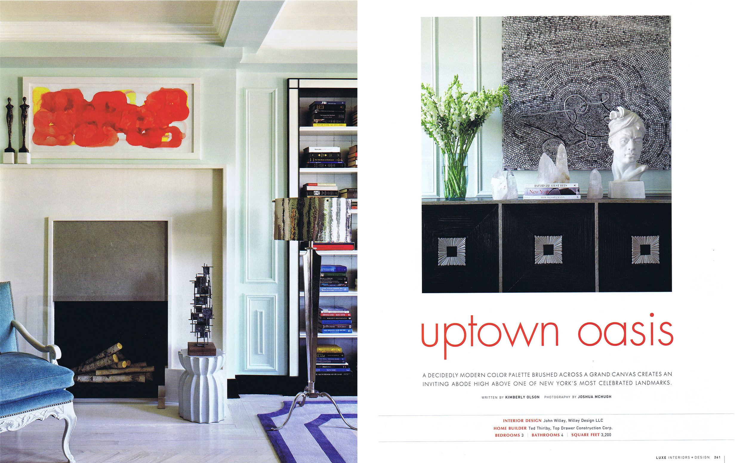
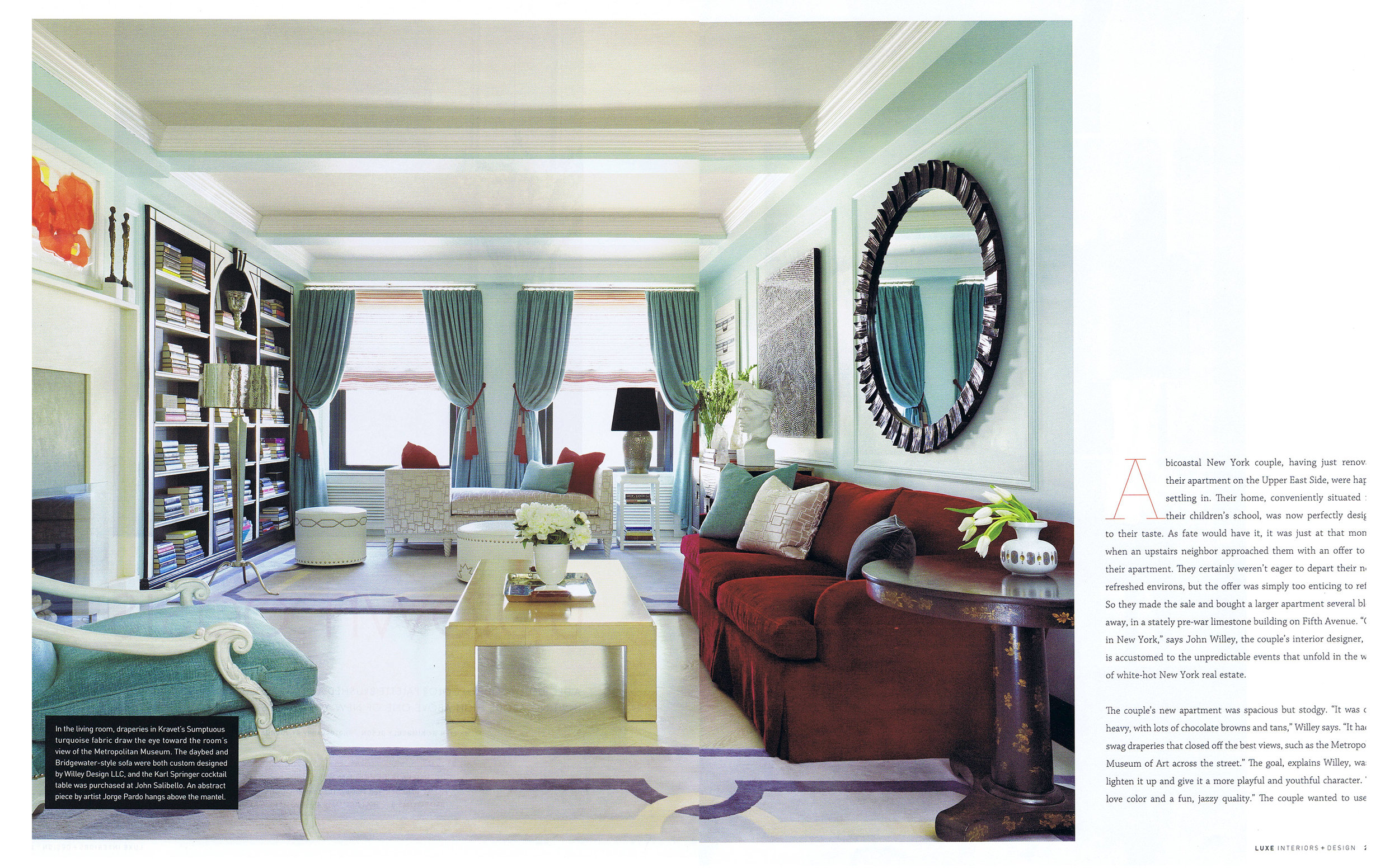
A bicoastal New York couple, having just renovated their apartment on the Upper East Side, were happily settling in. Their home, conveniently situated near their children’s school, was now perfectly designed to their taste. As fate would have it, it was just that moment when an upstairs neighbor approached them with an offer to buy their apartment. They certainly weren’t eager to depart their newly refreshed environs, but the offer was simply too enticing to refuse. So they made the sale and bought a larger apartment several blocks away, in a stately pre-war limestone building on Fifth Avenue. “Only in New York,” says John Willey, the couple’s interior designer, who is accustomed to the unpredictable events that unfold in the world of white-hot New York real estate.
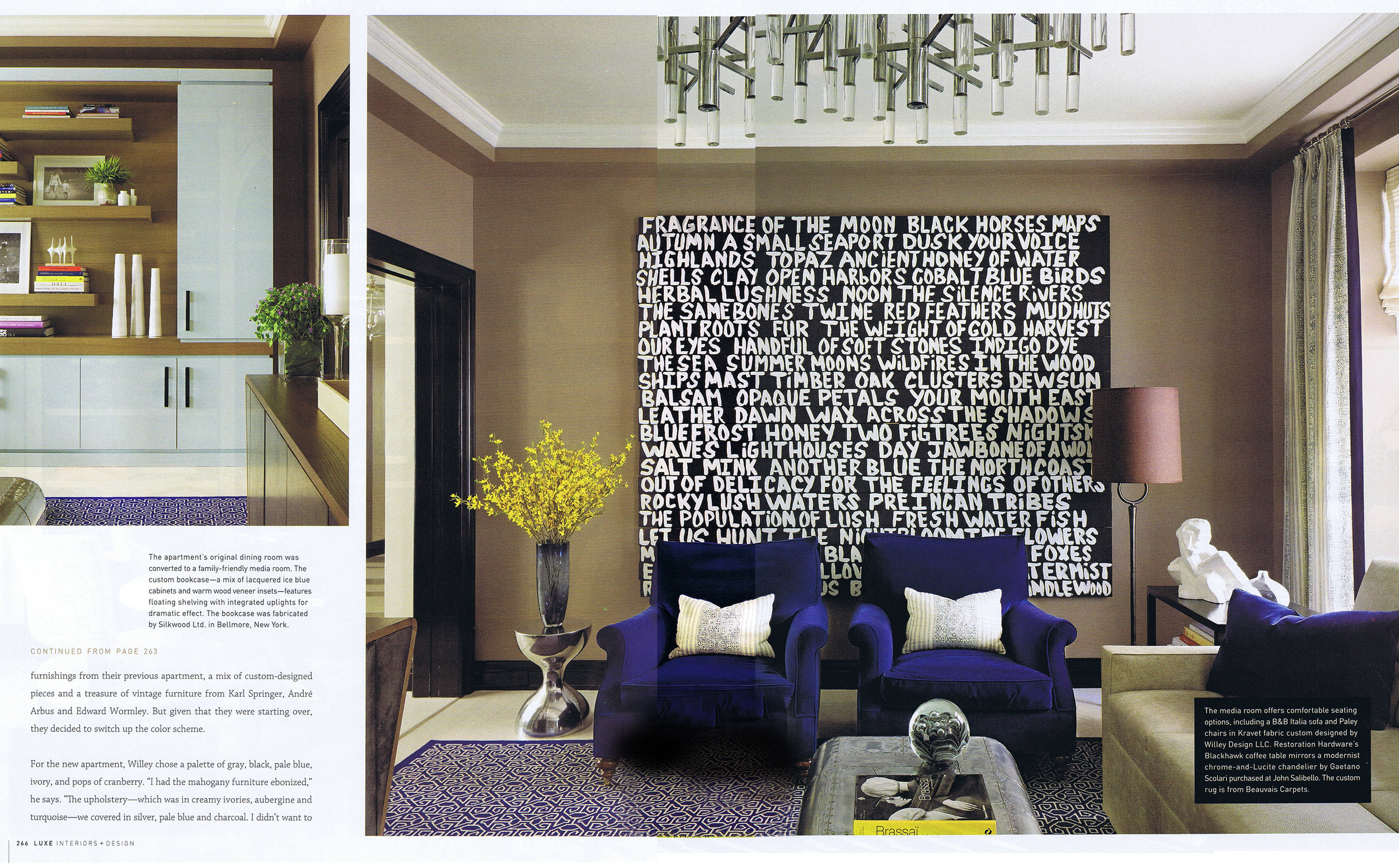
The couple’s new apartment was spacious but stodgy. “It was quite heavy, with lots of chocolate browns and tans,” Willey says. “It had big swag draperies that closed off the best views, such as the Metropolitan Museum of Art across the street.” The goal, explains Willey, was “to lighten it up and give it a more playful and youthful character. They love color and a fun, jazzy quality.” The couple wanted to use the furnishings from their previous apartment, a mix of custom-designed pieces and a treasure of vintage furniture from Karl Springer, André Arbus and Edward Wormley. But given that they were starting over, they decided to switch up the color scheme.
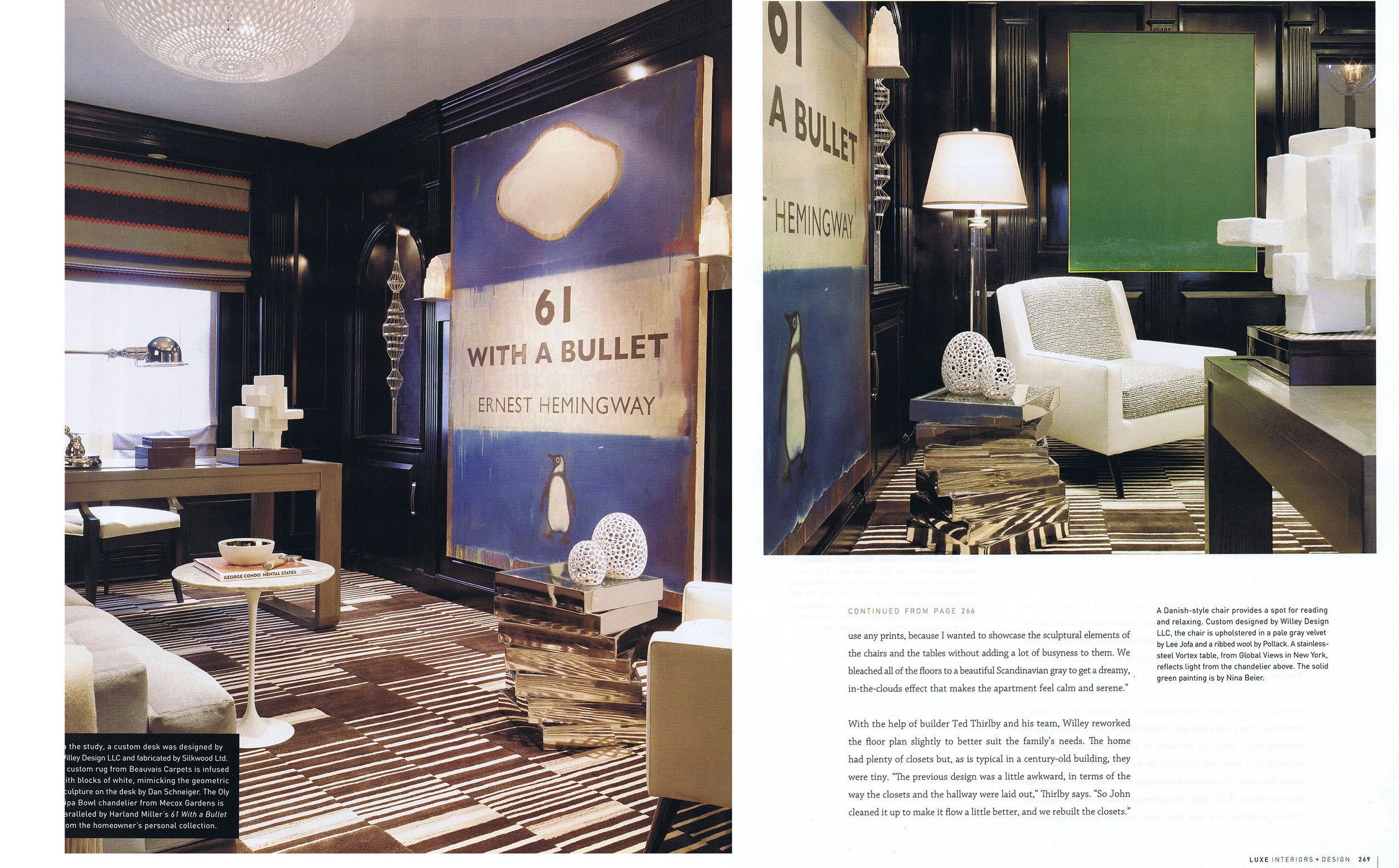
For the new apartment, Willey chose a palette of gray, black, pale blue, ivory, and pops of cranberry. “I had the mahogany furniture ebonized,” he says. “The upholstery – which was in creamy ivories, aubergine and turquoise – we covered in silver, pale blue and charcoal. I didn’t want to use any prints, because I wanted to showcase the sculptural elements of the chairs and the tables without adding a lot of busyness to them. We bleached all of the floors to a beautiful Scandinavian gray to get a dreamy, in-the-clouds effect that makes the apartment feel calm and serene.”
With the help of builder Ted Thirlby and his team, Willey reworked the floor plan slightly to better suit the family’s needs. The home had plenty of closets but, as is typical in a century-old building, they were tiny. “The previous design was a little awkward, in terms of the way the closets and the hallway were laid out,” Thirlby says. “So John cleaned it up to make it flow better.”
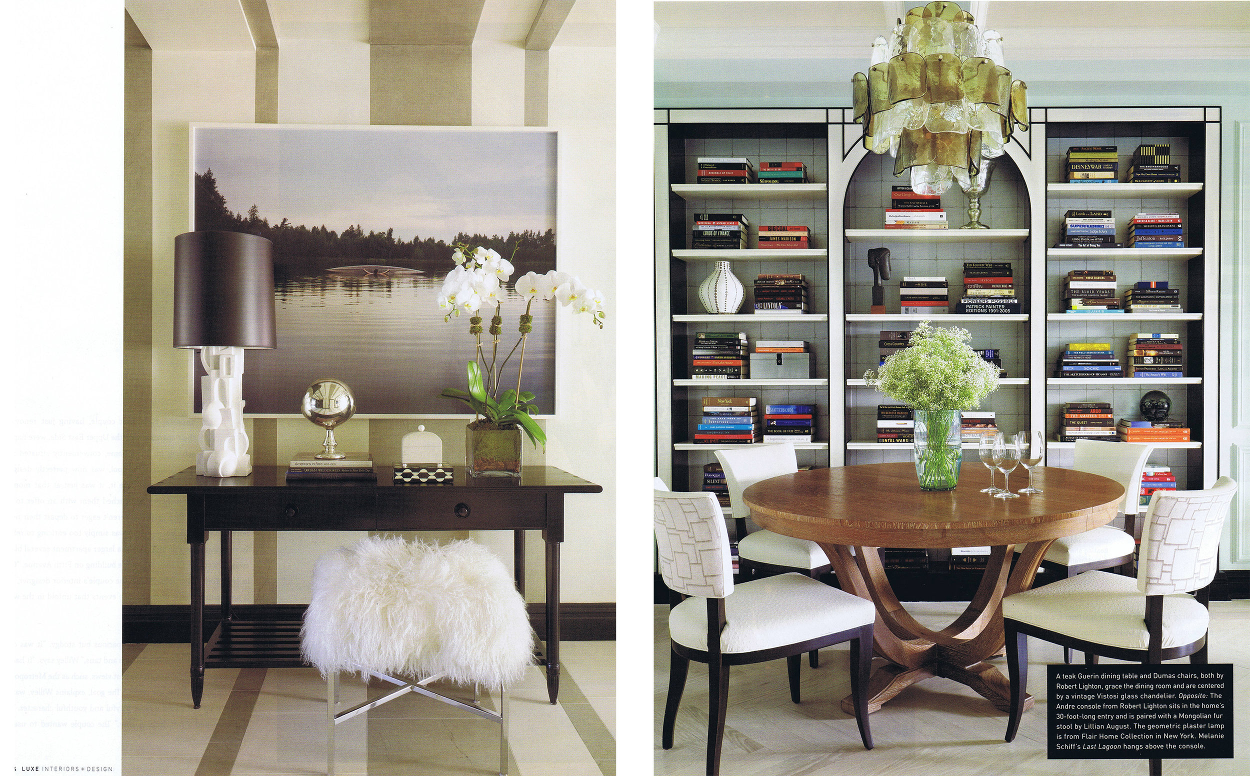
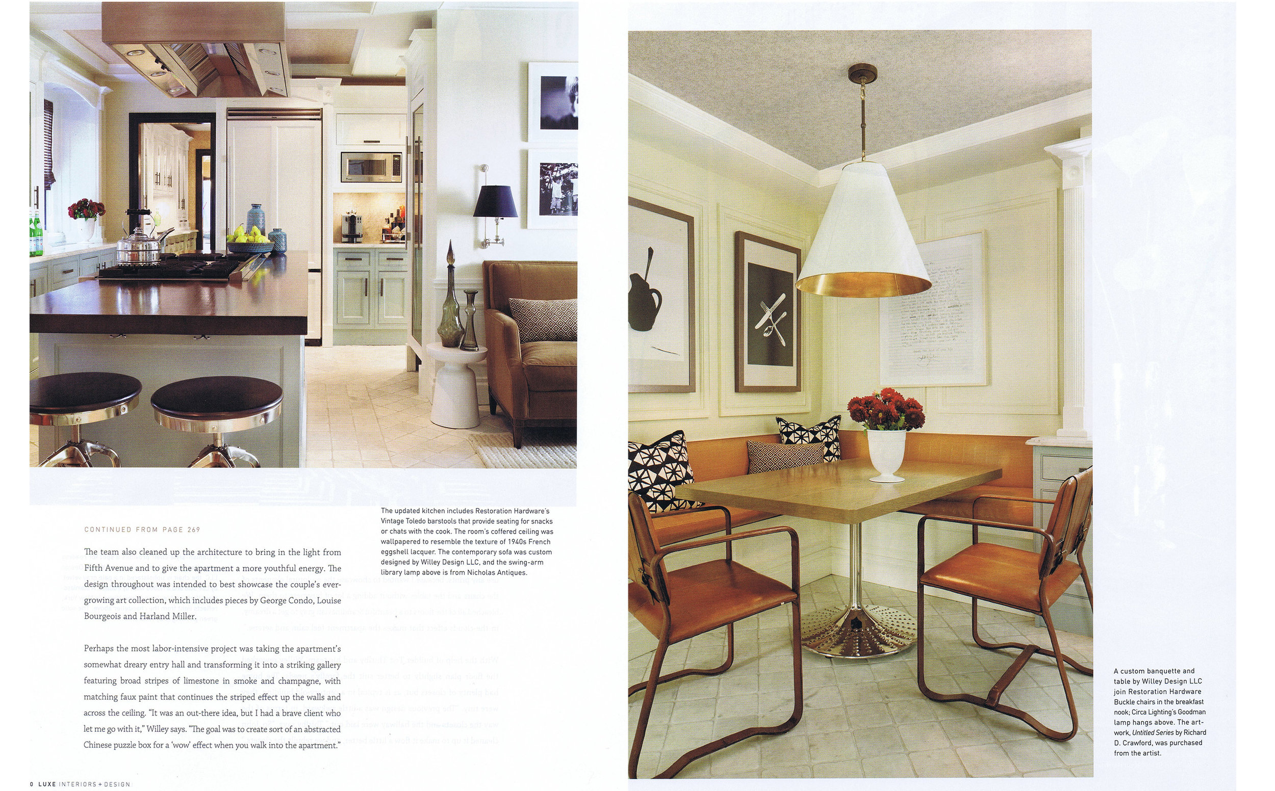
The team also cleaned up the architecture to bring in the light from Fifth Avenue and to give the apartment a more youthful energy. The design throughout was intended to best showcase the couple’s ever-growing art collection, which includes pieces by Louise Bourgeois and Harland Miller.
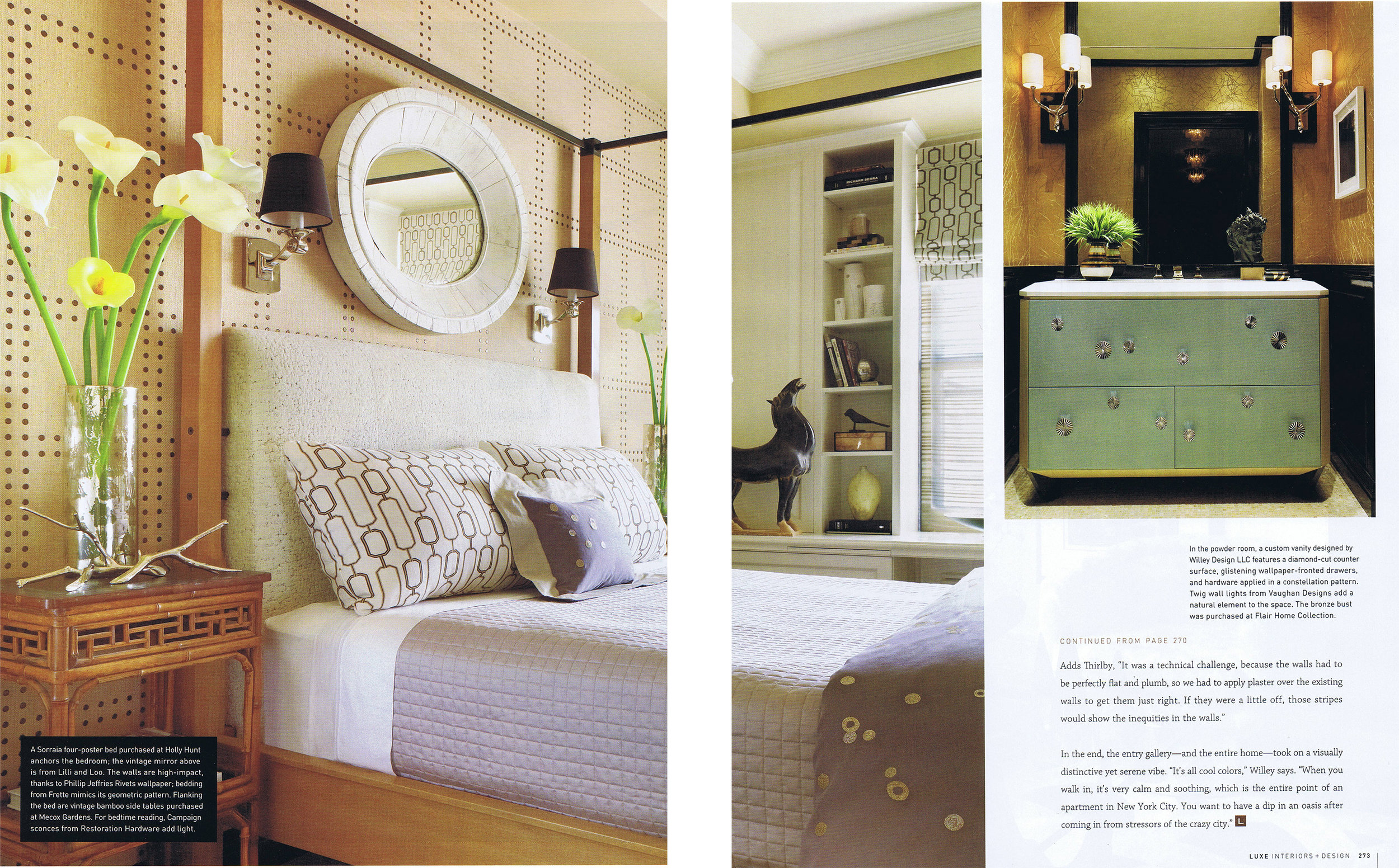
Perhaps the most labor-intensive project was taking the apartment’s somewhat dreary entry hall and transforming it into a striking gallery featuring broad stripes of limestone in smoke and champagne, with matching faux paint that continues the striped effect up the walls across the ceiling. “It was an out-there idea, but I have a brave client who let me go with it,” Willey says. “The goal was to create sort of an abstracted Chinese puzzle box for a ‘wow’ effect when you walk into the apartment.”
Adds Thirlby, “It was a technical challenge, because the walls had to be perfectly flat and plumb, so we had to apply plaster over the existing walls to get them just right. If they were a little off, those stripes would show the inequities in the walls.’
In the end, the entry gallery – and the entire home – took on a visually distinctive yet serene vibe. “It’s all cool colors,” Willey says. “When you walk in, it’s very calm and soothing, which is the entire point of an apartment in New York City. You want to have a dip in an oasis after coming in from stressors of the crazy city.”