Luxe Interiors + Design: FRESH START
A lively makeover for empty nesters adds vitality to an Upper West Side co-op in a 1908 landmark
When a 50s-something couple set out to go house-hunting on New York’s Upper West Side, little did they know they would find their designer first. “They called out of the blue,” says interior designer John Willey. “They had seen a renovation I had done, loved it and made a point to ask who did it. But, although they liked the design, they needed more space and continued with their home search.”
Empty nesters, the pair also wanted to start fresh, in a style different from the sleek and modern, almost-showroom-like, look they were accustomed to: think dark espresso woods. The couple soon found a place on Central Park West, just two blocks from where they were living, but the apartment needed an update, including mechanicals such as installing air conditioning, which resulted in a complete gut rethinking in both the decor and the floor plan. “It was very ornate,” says Willey, who filed his plans with Carlo Zaskorski of Zaskorski & Associates Architects, “heavy with picture moldings, crown moldings and a black-and-white marble foyer that looked like a hotel lobby.” So began a complete redesign to turn the spaces into ones that were both timeless and youthful.
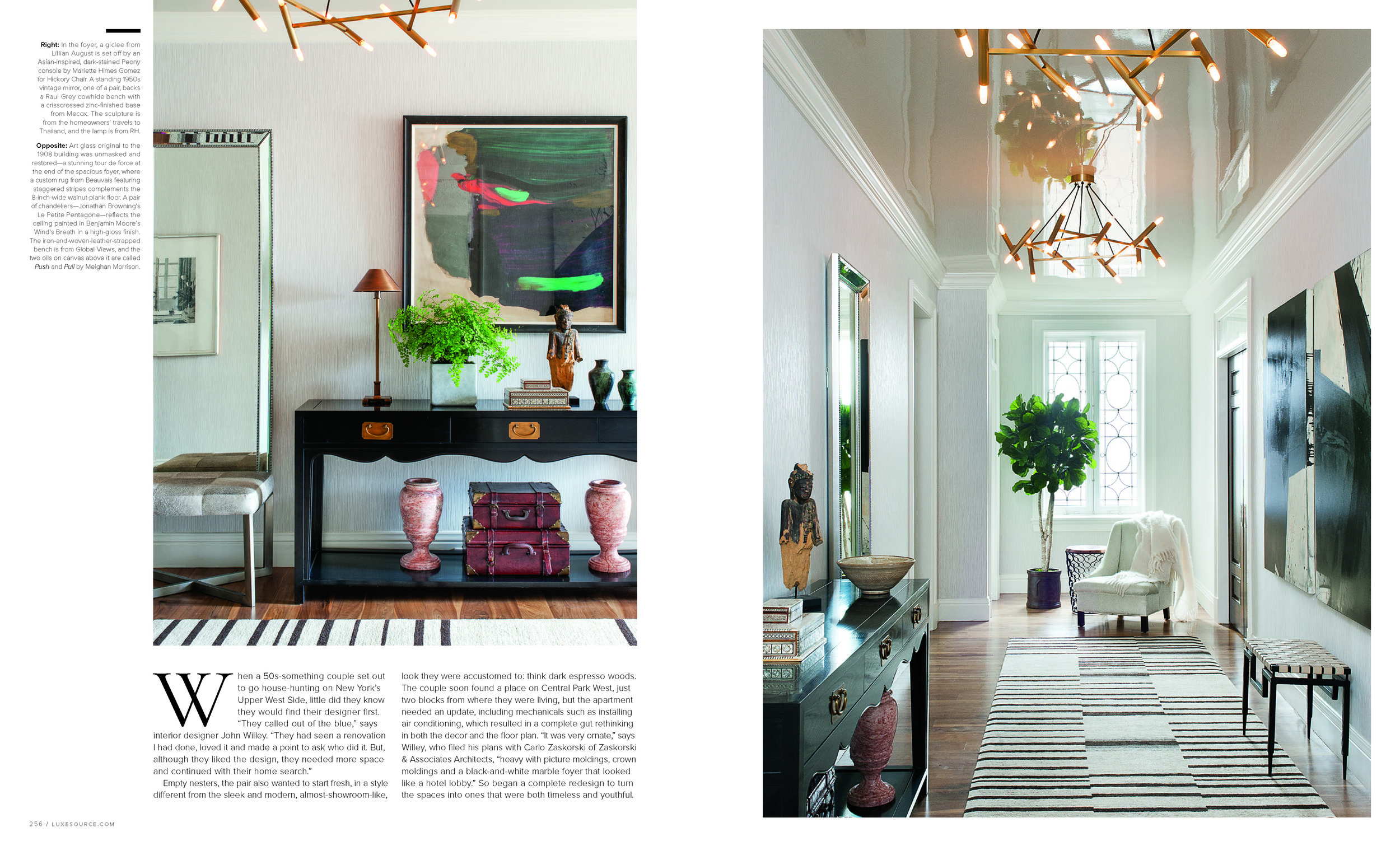
Early on, general contractors Jeffrey Sandreuter, project lead, and Robert Madia, who served as project manager, discovered one amazing surprise. At the end of that extraordinarily spacious foyer there was a leaded-glass window original to the 1908 landmark building that had been boarded up. “It was behind a wall,” says Sandreuter. “But it was a beautiful piece of glass. So, we took it out, sent it to our glazier and lead specialist and restored it.”
Willey then created drama in the foyer by covering the walls in a textured paper in a café au lait hue, adding a custom-designed graphic rug with staggered stripes and a pair of burnished antiqued-bronze light fixtures with frosted tubular bulbs that hang from a ceiling he had painted in beige lacquer. “The high-gloss ceiling really gives it a kick,” says general contractor Scott Hobbs, who oversaw the project along with Sandreuter and Madia.
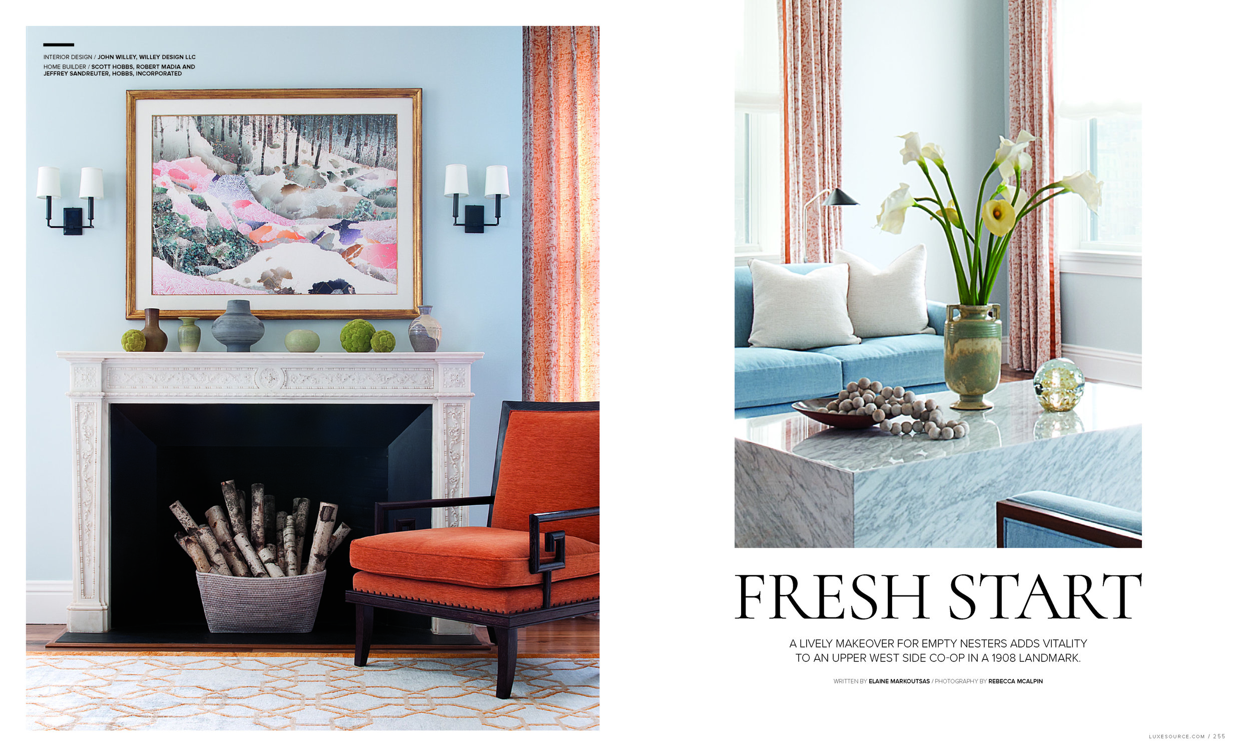
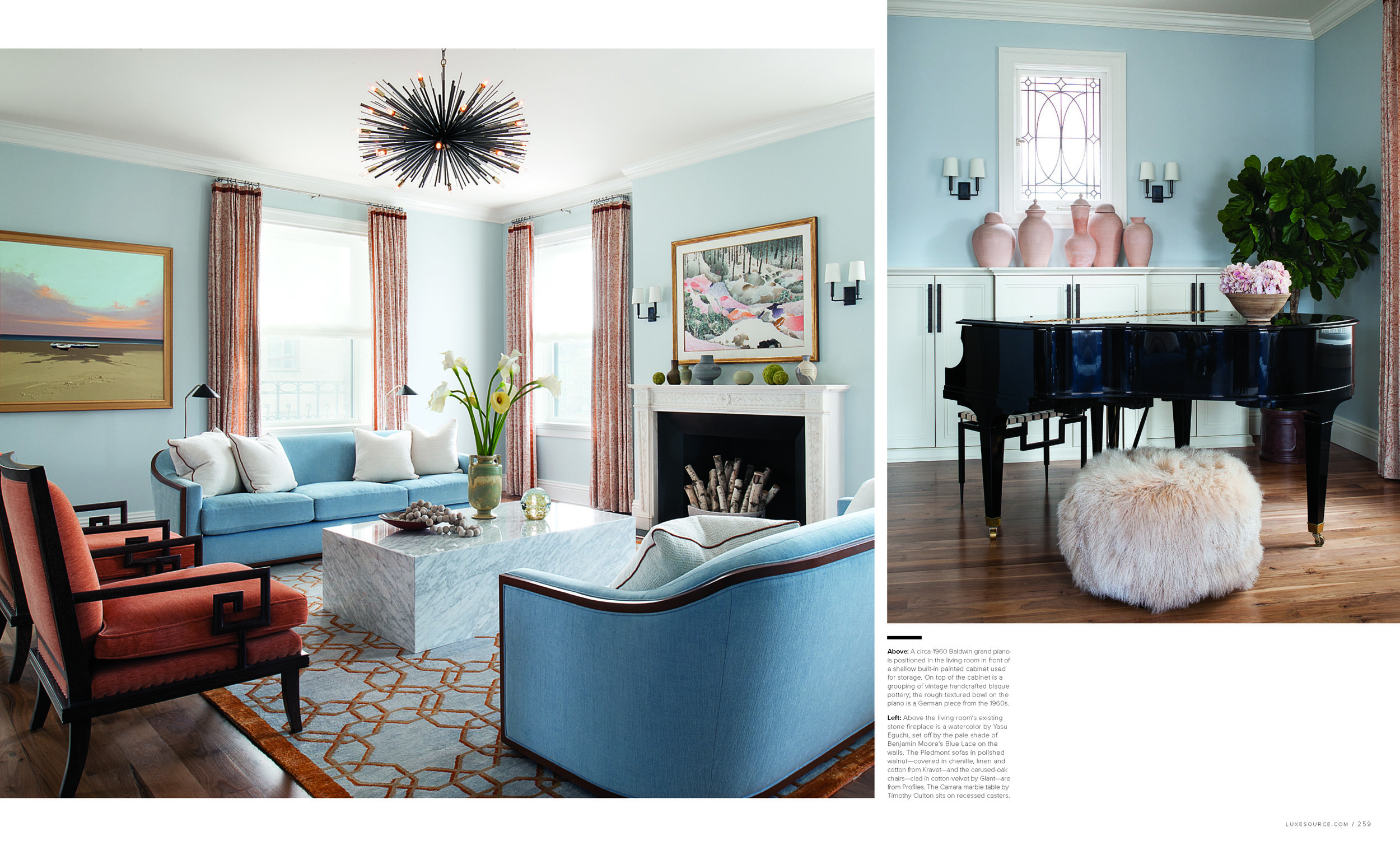
The foyer sets a relaxed yet sophisticated tone for the rest of the interiors. Although the homeowners originally asked for a little more color than they were accustomed to, Willey kept the palette soft, with pale shades of blue and terra cotta, as seen in the living room, where the designer chose the sofas for their shape. “The furniture is grouped around the fireplace,” he says, “and you’re seeing pieces from the backs and sides when you walk in. I just love the sofa’s sensually shaped backs. They’re beautiful and inviting. The chairs have Greek key side arms, and a beautifully formed Carrara marble table is on recessed casters, so it’s less monolithic and can be moved around.”
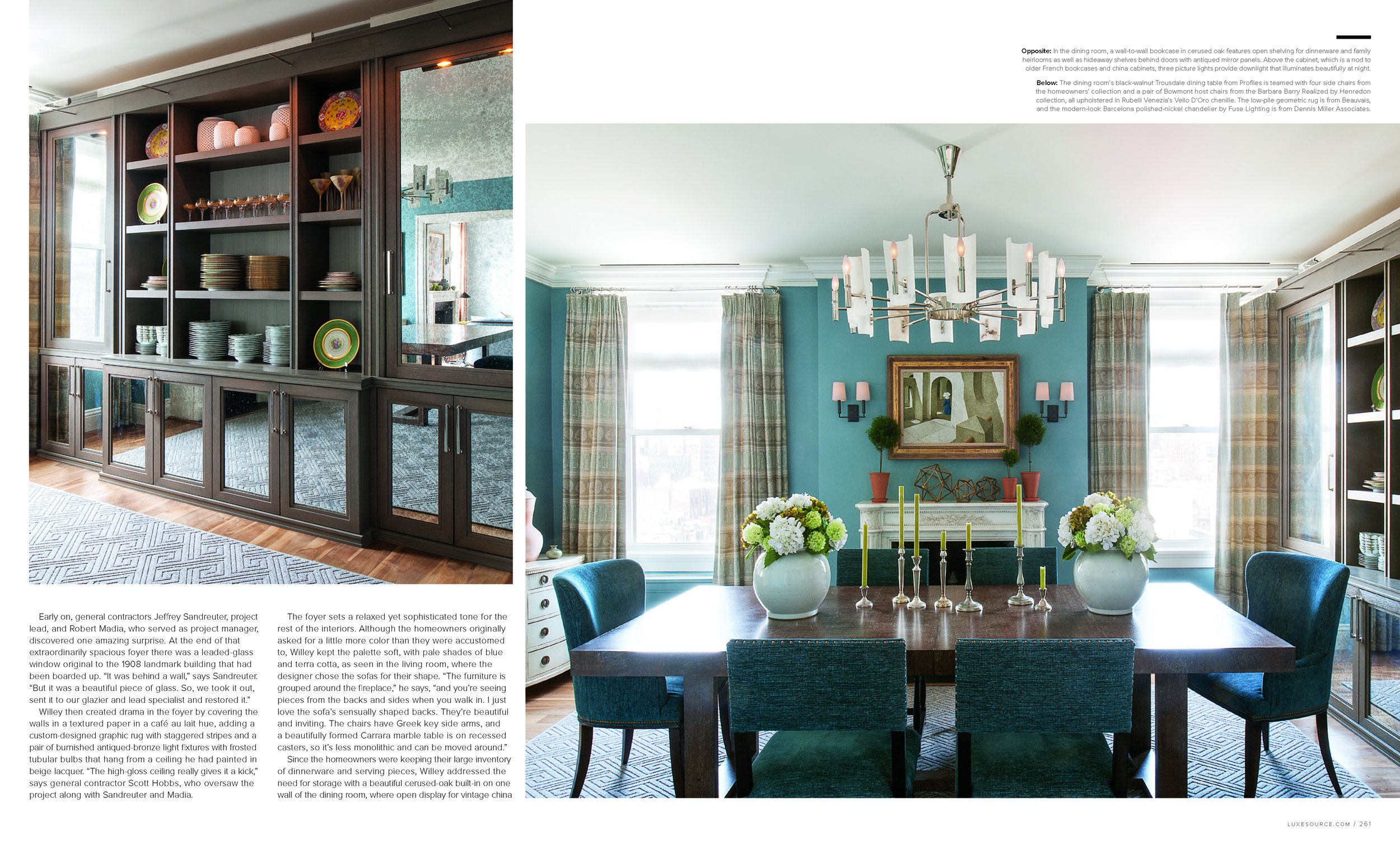
Since the homeowners were keeping their large inventory of dinnerware and serving pieces, Willey addressed the need for storage with a beautiful cerused-oak built-in on one wall of the dining room, where open display for vintage china and family heirloom pieces is combined with closed doors with antiqued mirror panels. Willey teamed the built-in with a cerused-oak table and the owners’ existing side chairs. He then added wing chairs upholstered in chenille in a shade of blue that perfectly matches the walls.
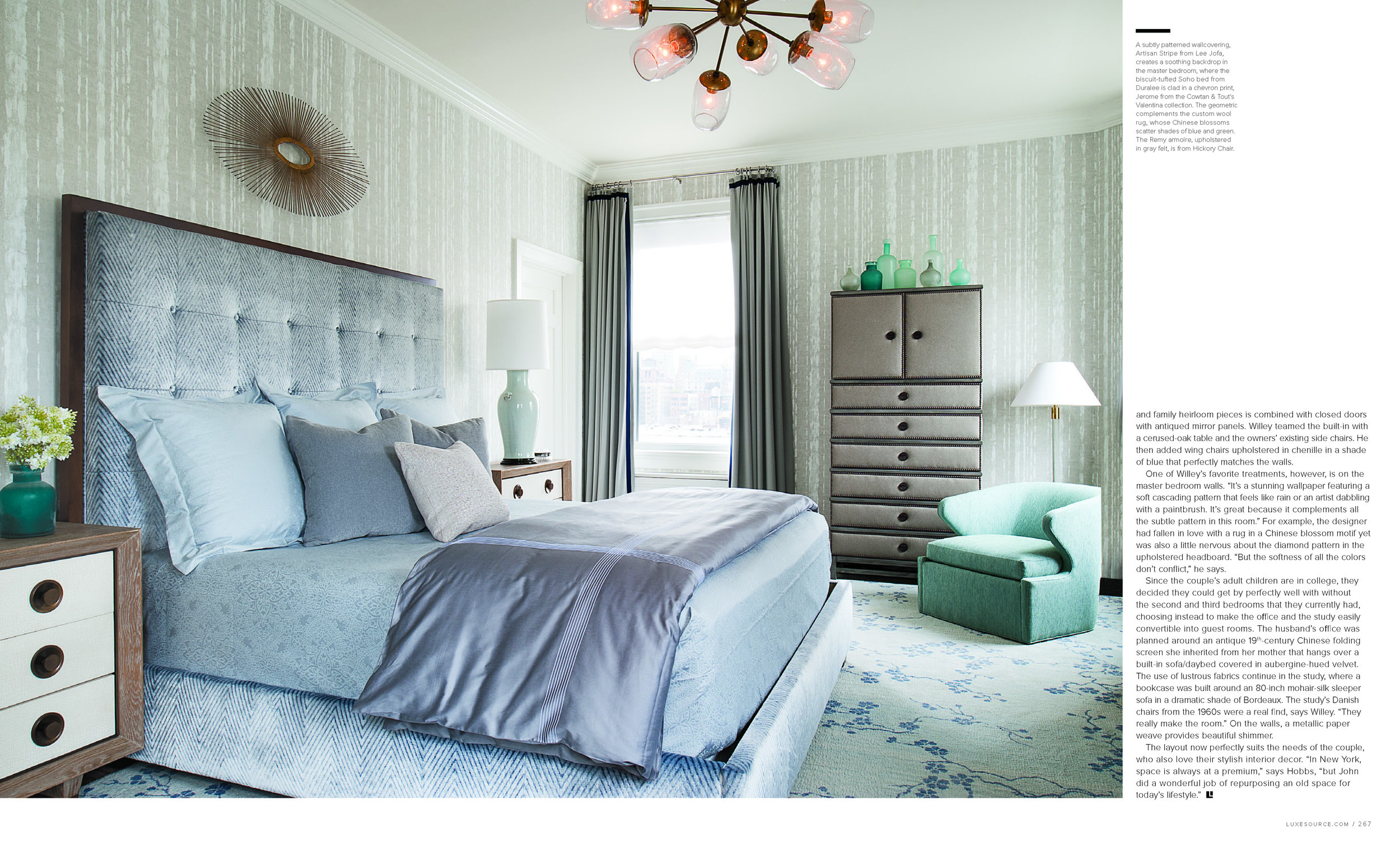
One of Willey’s favorite treatments, however, is on the master bedroom walls. “It’s a stunning wallpaper featuring a soft cascading pattern that feels like rain or an artist dabbling with a paintbrush. It’s great because it complements all the subtle pattern in this room.” For example, the designer had fallen in love with a rug in a Chinese blossom motif yet was also a little nervous about the diamond pattern in the upholstered headboard. “But the softness of all the colors don’t conflict,” he says.
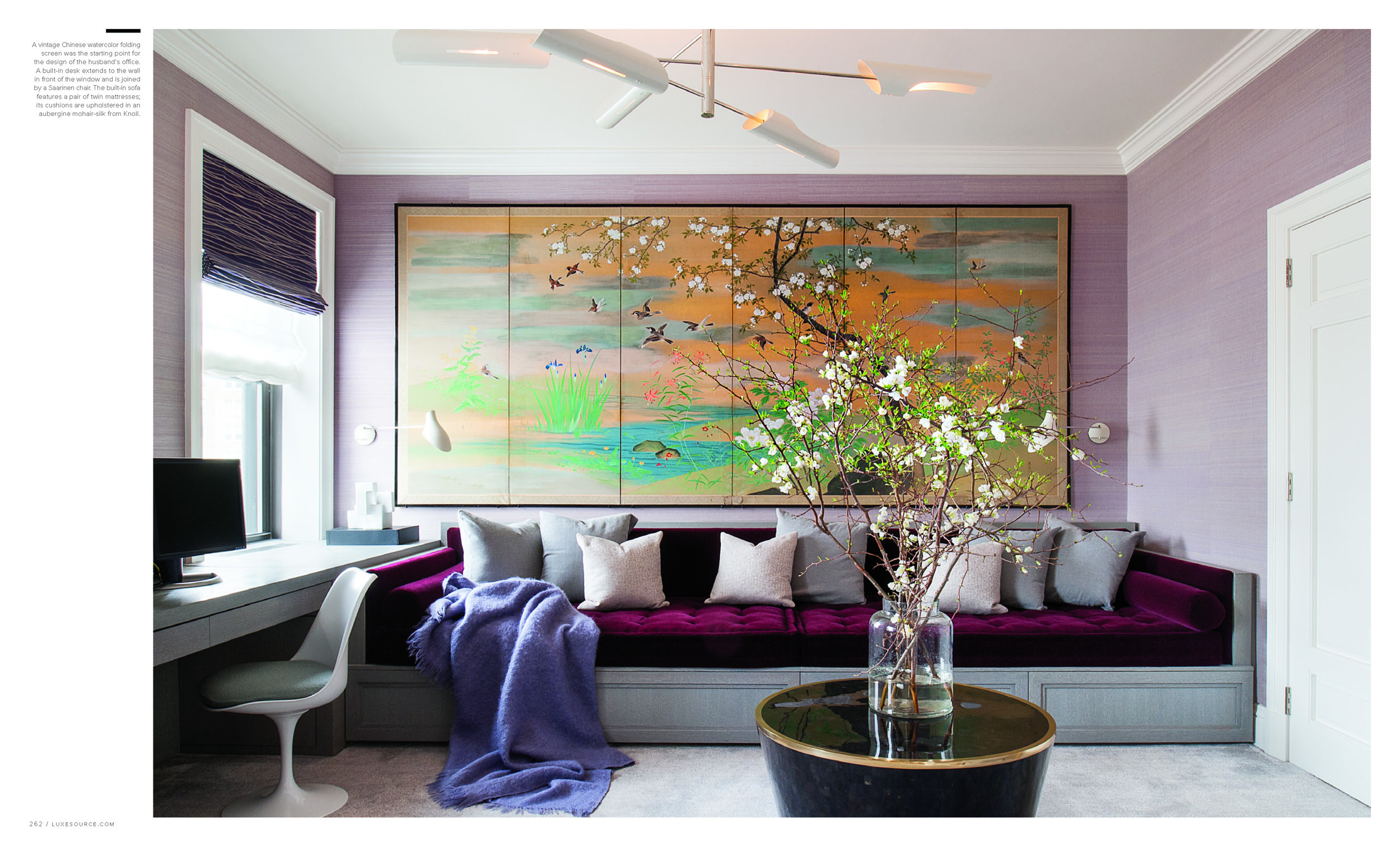
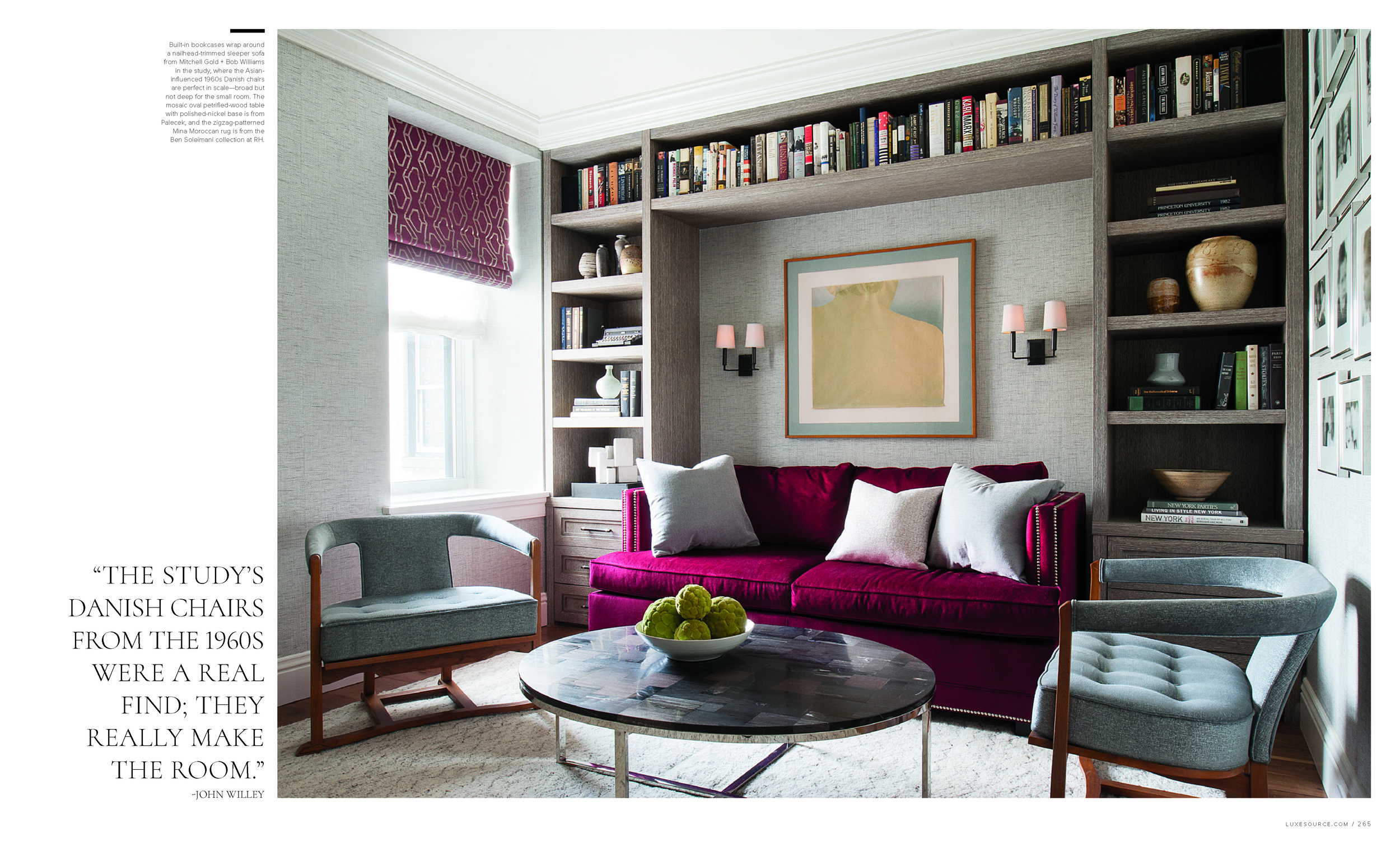
Since the couple’s adult children are in college, they decided they could get by perfectly well with without the second and third bedrooms that they currently had, choosing instead to make the office and the study easily convertible into guest rooms. The husband’s office was planned around an antique 19th-century Chinese folding screen she inherited from her mother that hangs over a built-in sofa/daybed covered in aubergine-hued velvet. The use of lustrous fabrics continue in the study, where a bookcase was built around an 80-inch mohair-silk sleeper sofa in a dramatic shade of Bordeaux. The study’s Danish chairs from the 1960s were a real find, says Willey. “They really make the room.” On the walls, a metallic paper weave provides beautiful shimmer.
The layout now perfectly suits the needs of the couple, who also love their stylish interior decor. “In New York, space is always at a premium,” says Hobbs, “but John did a wonderful job of repurposing an old space for today’s lifestyle.”

