Home Concepts: California Dreamin'
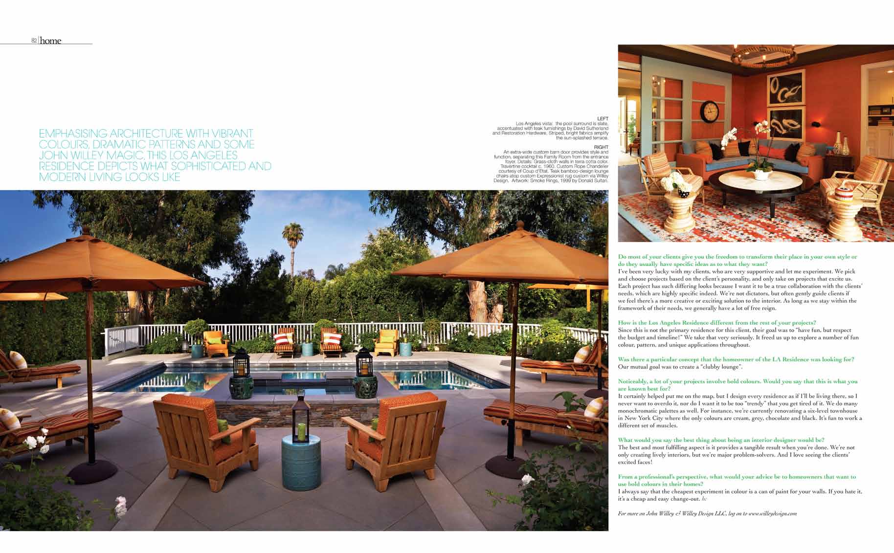
A district that sits at the base of Santa Monica, boasts a 6,000 square foot residence that screams Los Angeles’s glitzy and summer-like lifestyle
This five-bedroom 6,000 square foot residence in the upscale Brentwood neighborhood of Los Angeles was given a playful facelift to give it a more personal and youthful character. This was realised with a witty but elegant mix of colour, pattern, and texture for young clients with two small children. A “relaxed glamour” approach was used to create high-style design and durability, and with major celebrities as prominent neighbors, Willey Design had to amplify the glamour quotient that best represents what Los Angeles is most famous for.
John Willey embellished every detail, embracing every inch of the home with as many fun elements as possible: streamlined fireplaces, a nine-foot sliding barn door divider, applying wallpaper (including to the ceilings), before introducing an eclectic mix of furniture from both Los Angeles and New York City. The pool and patio were redesigned and energised, transforming a standard Los Angeles pool area into a multi-hued haven for relaxing or sunset cocktails. The décor’s final effect: a jazzy lift to a traditional interior, without slinking into Hollywood Regency or mid-Century modern, an overindulgence of many Los Angeles residences lately.
The home provides a complimentary mix of furniture periods and styles, creating a cohesive, beguiling lair that lends to entertaining, or movies at home with the kids, a perfect metaphor for the sophistication and irreverence in this renovation.
About The Residence:
For most of us 80s babies, famous hit sitcom The Fresh Prince of Bel Air comes to mind when the district Brentwood is mentioned. But New York City-based John Willey is making a mark by creating stunning living environments for homeowners, this Los Angeles Residence a shining example.
Colours are prominent throughout the exterior and interior of this luscious home. The mixture of warm and bright tones with a sudden burst of graphic wallpaper makes an amazing result. According to principal designer, John Willey, “Interior design should not be considered an experience for only the well-to-do, but for anyone interested in improving their lives by surrounding them with what brings them joy. For me, great design is a healthy blend of smart investment items mixed with offbeat selections, realising their space’s full potential with a breath of fresh air.”
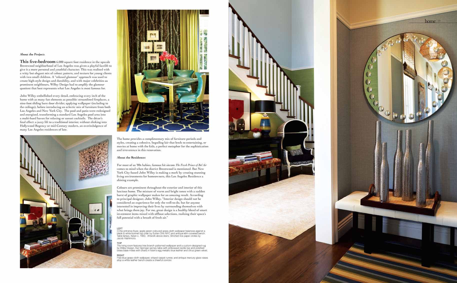
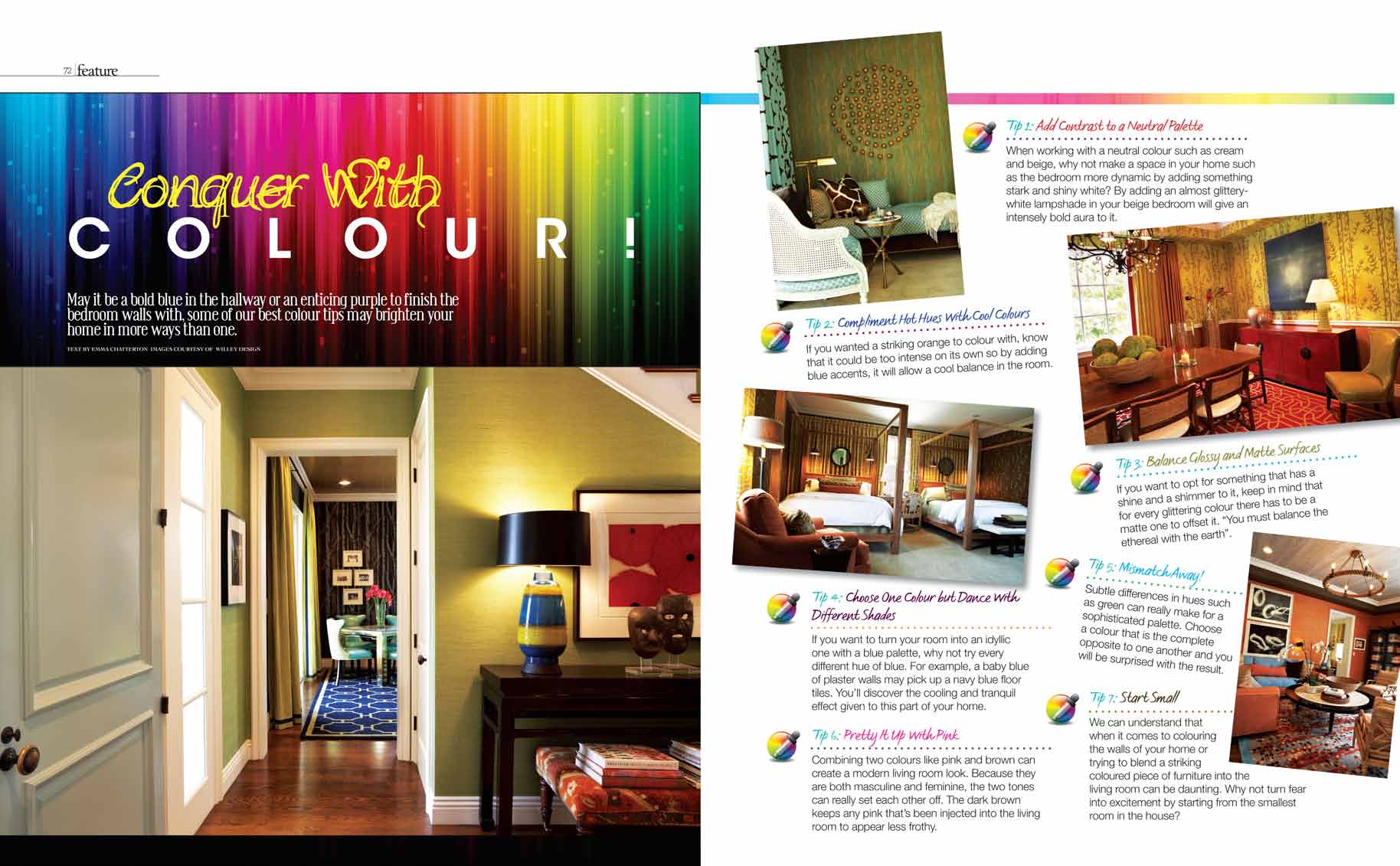
The foyer of the house gives just the right introduction to the provocative yet luxuriously designed retreat. Known for their bold and refined approach towards their client’s needs, Willey Design combined modern and classic furnishings throughout to create the design scheme, which includes vital measures of comfort and practicality.
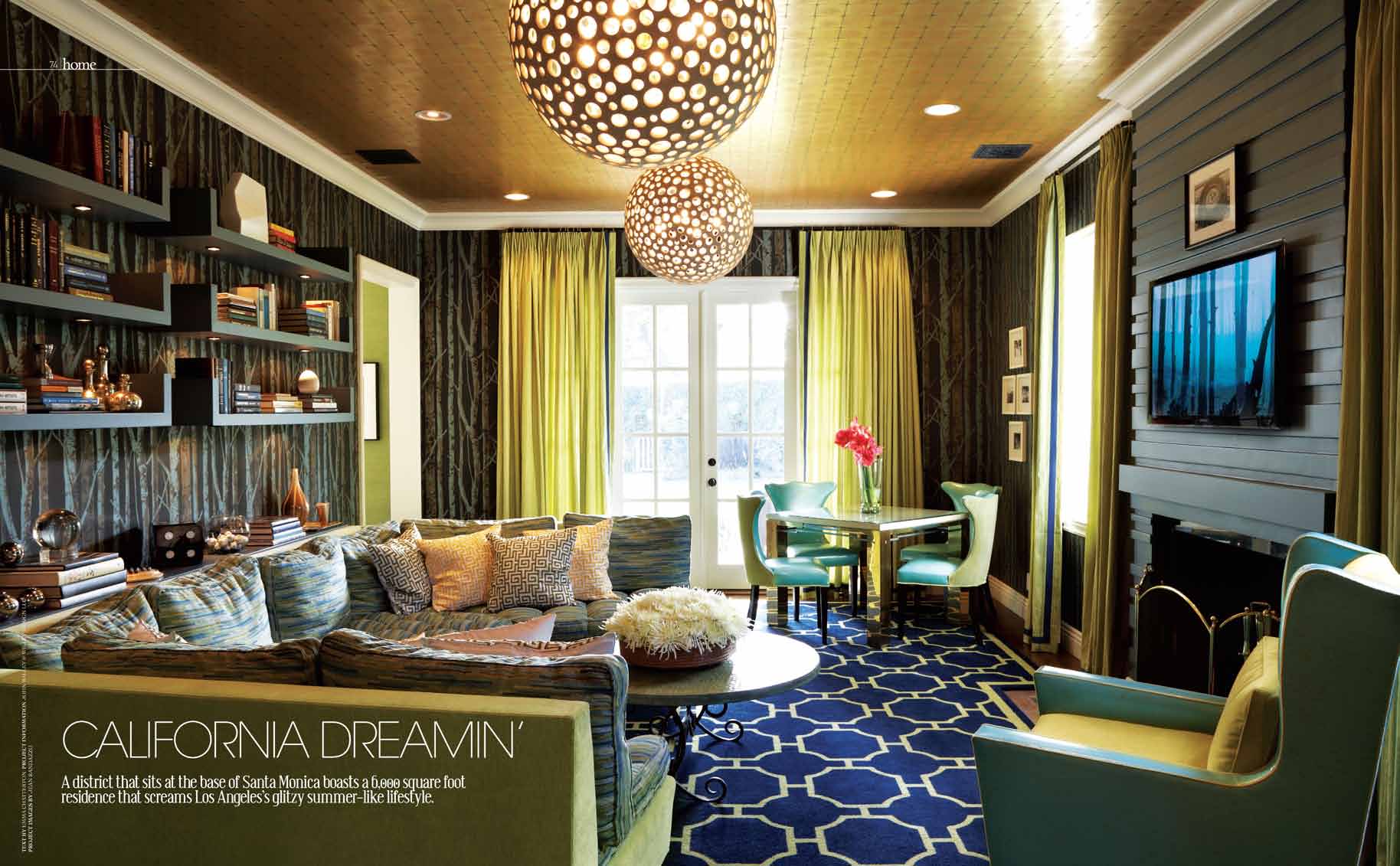
When transforming a home, vivid colour palettes and patterns are less than likely the direction that most would take. But as the living room demonstrates, when pale blue and lime green are combined with a royal blue carpet, it becomes an exotic almost unrecognisable space. The dark shades chosen for the ceilings and on some part of the walls blend beautifully together. “It was the Los Angeles residence for my New York City-based client. They wanted a fun getaway on the west coast, so I introduced patterns, colours, and a youthful approach,” Willey mentioned. “I wanted the living room to be a party room for the kids and the parents’ sophisticated tastes for entertaining.”
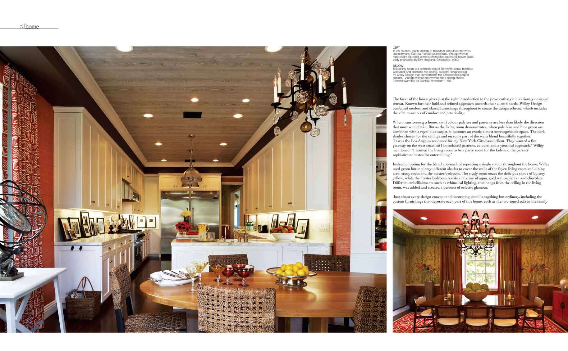
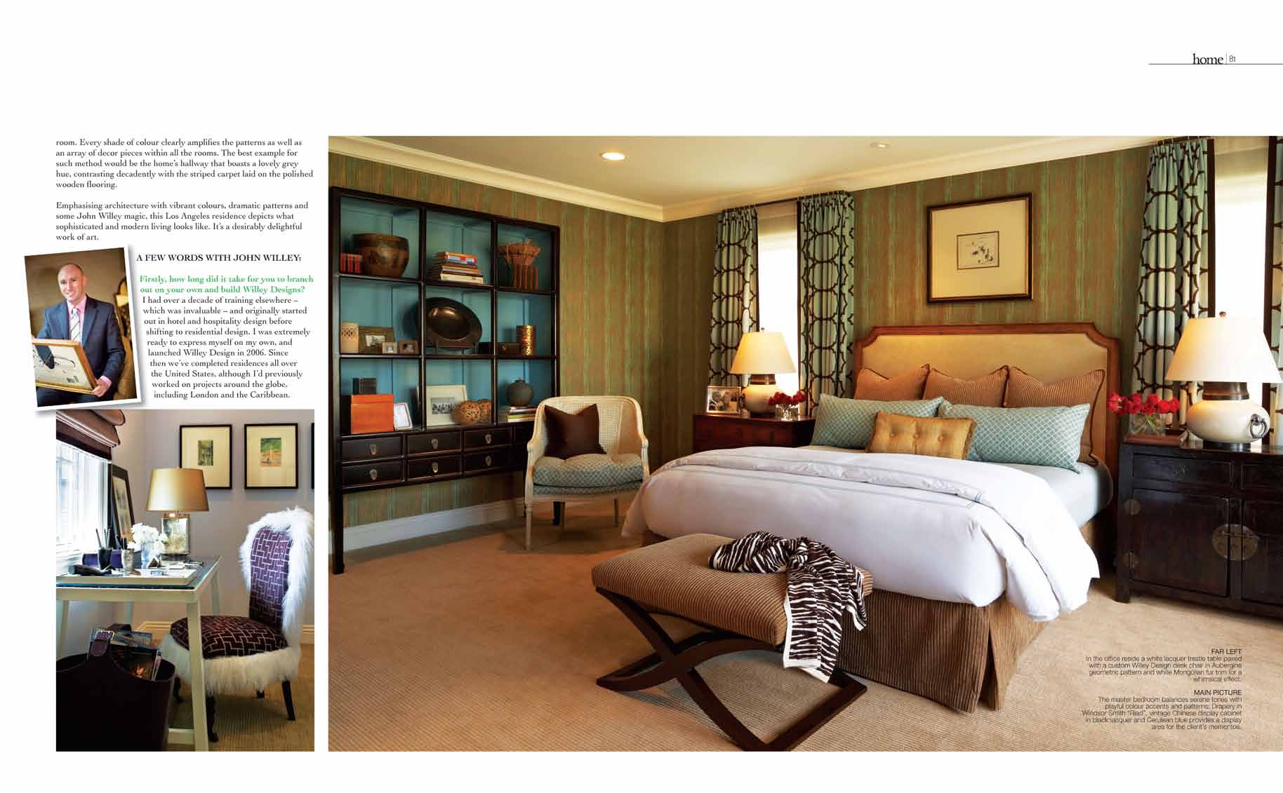
Instead of opting for the bland approach of repeating a single colour throughout the home, Willey used green but in plenty different shades to cover the walls of the foyer, living room, dining area, study room and the master bedroom. The study room oozes the delicious shade of buttery yellow, while the master bedroom boasts a mixture of aqua, gold wallpaper, tan and chocolate. Different embellishments such as whimsical lighting, that hangs from the ceiling in the living room, was added and created a persona of eclectic glamour.
Just about every design concept and decorating detail is anything but ordinary, including the custom furnishings that decorate each part of this home, such as the two-toned sofa in the family room. Every shade of colour clearly amplifies the patterns as well as an array of decor pieces within all the rooms. The best example for such method would be the home’s hallway that boasts a lovely grey hue, contrasting decadently with the striped carpet laid on the polished wooden flooring.
Emphasizing architecture with vibrant colours, dramatic patterns and some John Willey magic, this Los Angeles residence depicts what sophisticated and modern living looks like. It’s a desirably delightful work of art.
A FEW WORDS WITH JOHN WILLEY:
Firstly, how long did it take for you to branch out on your own and build Willey Designs?
I had over a decade of training elsewhere — which was invaluable — and originally started out in hotel and hospitality design before shifting to residential design. I was extremely ready to express myself on my own, launched Willey Design in 2006. Since then we’ve completed residences all over the United States, although I’d previously worked on projects around the globe, including London and the Caribbean.
Do most of your clients give you the freedom to transform their place in your own style or do they usually have specific ideas as to what they want?
I’ve been very lucky with my clients, who are very supportive and let me experiment. We pick and choose projects based on the client’s personality, and only take on projects that excite us. Each project has such differing looks because I want it to be a true collaboration with the clients’ needs, which are highly specific indeed. We’re not dictators, but often gently guide clients if we feel there’s a more creative or exciting solution to the interior. As long as we stay within the framework of their needs, we generally have a lot of free reign.
How is the Los Angeles Residence different from the rest of your projects?
Since this is not the primary residence for this client, their goal was to “have fun, but respect the budget and timeline!” We take that very seriously. It freed us up to explore a number of fun colour, pattern, and unique applications throughout.
Was there a particular concept that the homeowner of the Los Angeles Residence was looking for?
Our mutual goal was to create a “clubby lounge .”
Noticeably, a lot of your projects involve bold colours. Would you say that this is what you are known best for?
It certainly helped put me on the map, but I design every residence as if I’ll be living there, so I never want to overdo it, nor do I want it to be too “trendy” that you get tired of it. We do many monochromatic palettes as well. For instance, we’re currently renovating a six-level townhouse in New York City where the only colours are cream, gray, chocolate and black. It’s fun to work a different set of muscles.
What would you say the best thing about being an interior designer would be?
The best and most fulfilling aspect is it provides a tangible result when you’re done. We’re not only creating lively interiors, but we’re major problem-solvers. And I love seeing the clients’ excited faces!
From a professional’s perspective, what would your advice be to homeowners that want to use bold colours in their home?
I always say that the cheapest experiment in colour is a can of paint for your walls. If you hate it, it’s a cheap and easy change-out.

