
House Beautiful: Sea + Sky + Citron
LISA CREGAN: Gray-shingled old Nantucket has never looked so colorful.
JOHN WILLEY: This is a guesthouse, and it’s meant to be fun, to be a bright, cheery departure from the usual Nantucket blue and white interior. The invitation was to let go.
LC: And so you did — with gusto.
JW: When we were planning back in New York, my client pointed to a Philip Taaffe abstract painting in her apartment and said she wanted the cottage to feel like she was inside that painting. It’s a riot of colors: corals, turquoises, bright yellows and blues. She didn’t want a whitewashed beach cottage. Okay with me. My motto is, “Life’s too short for an all-beige room.”
LC: So where did you start?
JW: I always start with the carpets and build up from the floor, but I’m not one of those designers who says, “I took a thread from the carpet and repeated it throughout the room.” For me, the rugs are just the starting points for building layers of color. I don’t like a place that looks like a decorator just waved a wand, did everything in two shades of one color, and stepped out the door.
LC: What’s your issue with two shades of one color?
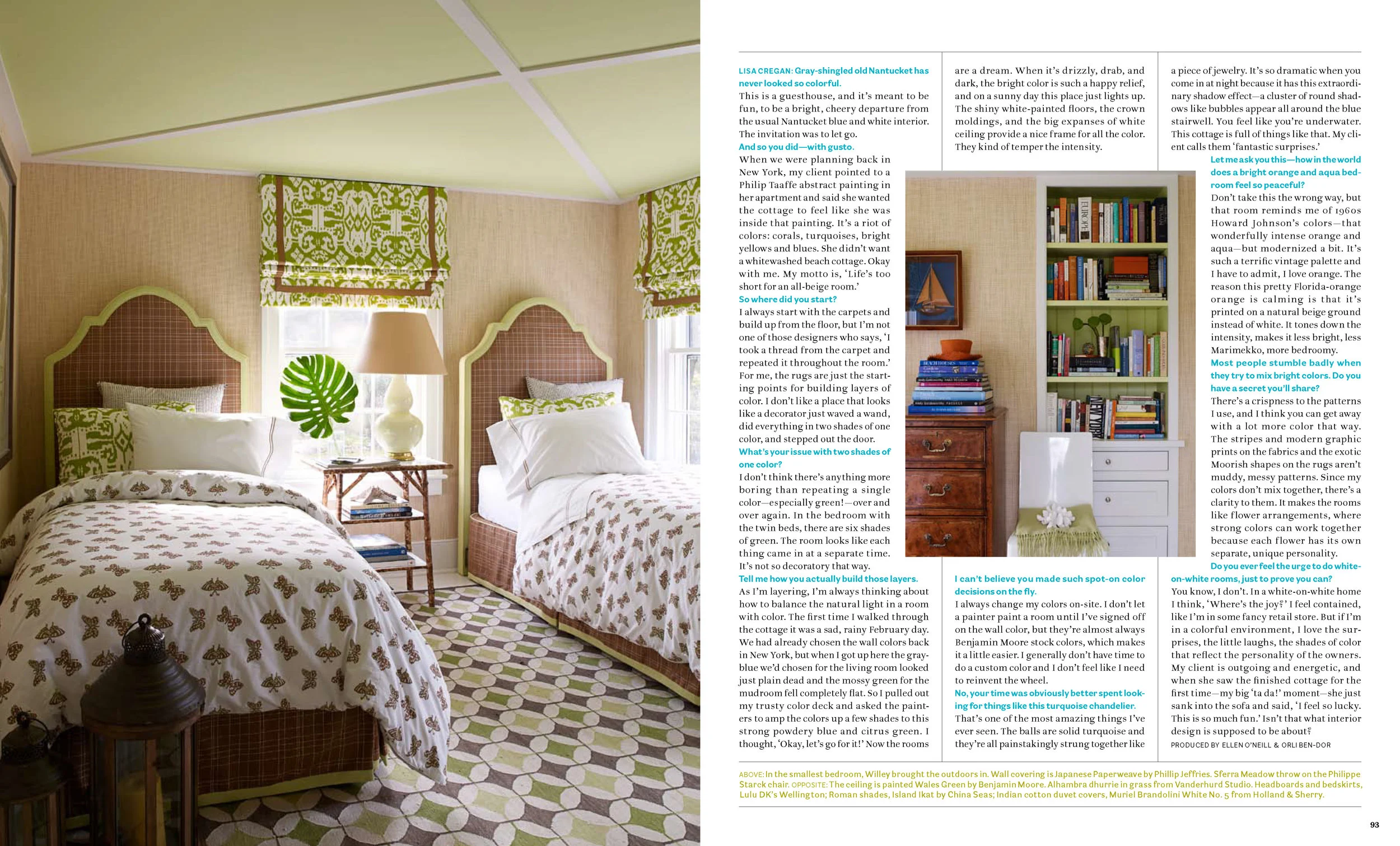
JW: I don’t think there’s anything more boring than repeating a single color — especially green! — over and over again. In the bedroom with the twin beds, there are six shades of green. The room looks like each thing came in at a separate time. It’s not so decoratory that way.
LC: Tell me how you actually build those layers.
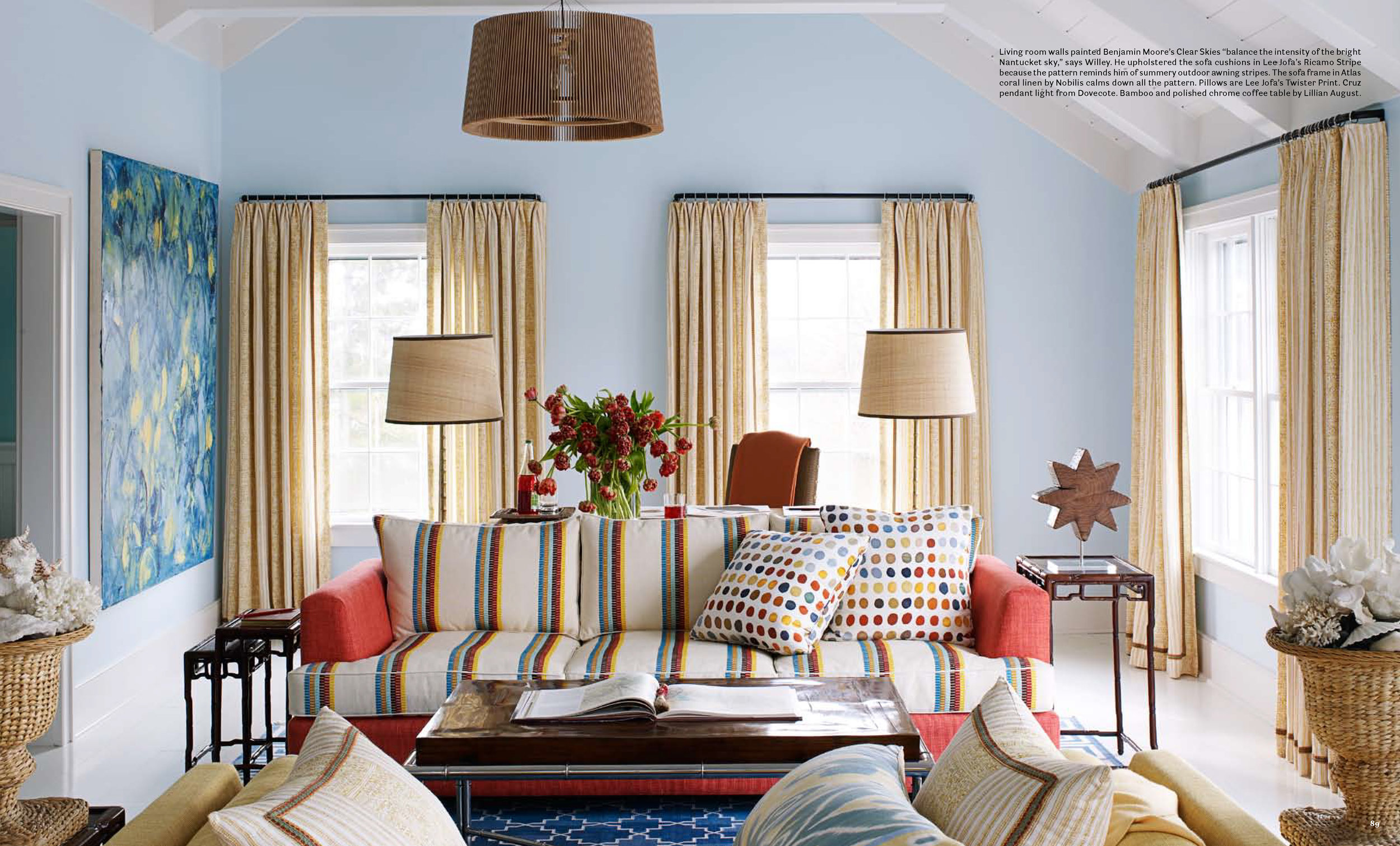
JW: As I’m layering, I’m always thinking about how to balance the natural light in a room with color. The first time I walked through the cottage it was a sad, rainy February day. We had already chosen the wall colors back in New York, but when I got up here the gray-blue we’d chosen for the living room looked just plain dead and the mossy green for the mudroom fell completely flat. So I pulled out my trusty color deck and asked the painters to amp the colors up a few shades to this strong powdery blue and citrus green. I thought, “Okay, let’s go for it!” Now the rooms are a dream. When it’s drizzly, drab, and dark, the bright color is such a happy relief, and on a sunny day this place just lights up. The shiny white-painted floors, the crown moldings, and the big expanses of white ceiling provide a nice frame for all the color. They kind of temper the intensity.
LC: I can’t believe you made such spot-on color decisions on the fly.
JW: I always change my colors on-site. I don’t let a painter paint a room until I’ve signed off on the wall color, but they’re almost always Benjamin Moore stock colors, which makes it a little easier. I generally don’t have time to do a custom color and I don’t feel like I need to reinvent the wheel.
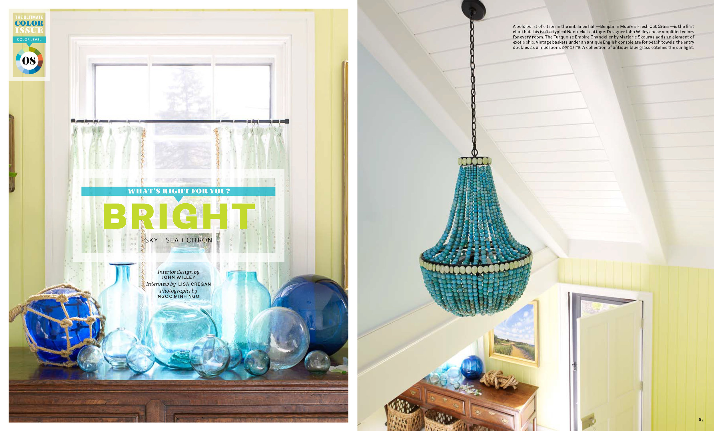
LC: No, your time was obviously better spent looking for things like this turquoise chandelier.
JW: That’s one of the most amazing things I’ve ever seen. The balls are solid turquoise and they’re all painstakingly strung together like a piece of jewelry. It’s so dramatic when you come in at night because it has this extraordinary shadow effect — a cluster of round shadows like bubbles appear all around the blue stairwell. You feel like you’re underwater. This cottage is full of things like that. My client calls them “fantastic surprises.”
LC: Let me ask you this — how in the world does a bright orange and aqua bedroom feel so peaceful?
JW: Don’t take this the wrong way, but that room reminds me of 1960s Howard Johnson’s colors — that wonderfully intense orange and aqua — but modernized a bit. It’s such a terrific vintage palette and I have to admit, I love orange. The reason this pretty Florida-orange orange is calming is that it’s printed on a natural beige ground instead of white. It tones down the intensity, makes it less bright, less Marimekko, more bedroomy.
LC: Most people stumble badly when they try to mix bright colors. Do you have a secret you’ll share?
JW: There’s a crispness to the patterns I use, and I think you can get away with a lot more color that way. The stripes and modern graphic prints on the fabrics and the exotic Moorish shapes on the rugs aren’t muddy, messy patterns. Since my colors don’t mix together, there’s a clarity to them. It makes the rooms like flower arrangements, where strong colors can work together because each flower has its own separate, unique personality.
LC: Do you ever feel the urge to do white-on-white rooms, just to prove you can?
JW: You know, I don’t. In a white-on-white home I think, “Where’s the joy?” I feel contained, like I’m in some fancy retail store. But if I’m in a colorful environment, I love the surprises, the little laughs, the shades of color that reflect the personality of the owners. My client is outgoing and energetic, and when she saw the finished cottage for the first time — my big “ta da!” moment — she just sank into the sofa and said, “I feel so lucky. This is so much fun.” Isn’t that what interior design is supposed to be about?