New York Spaces: SERENITY NOW
John Willey shows how Zen doesn’t have to be beige
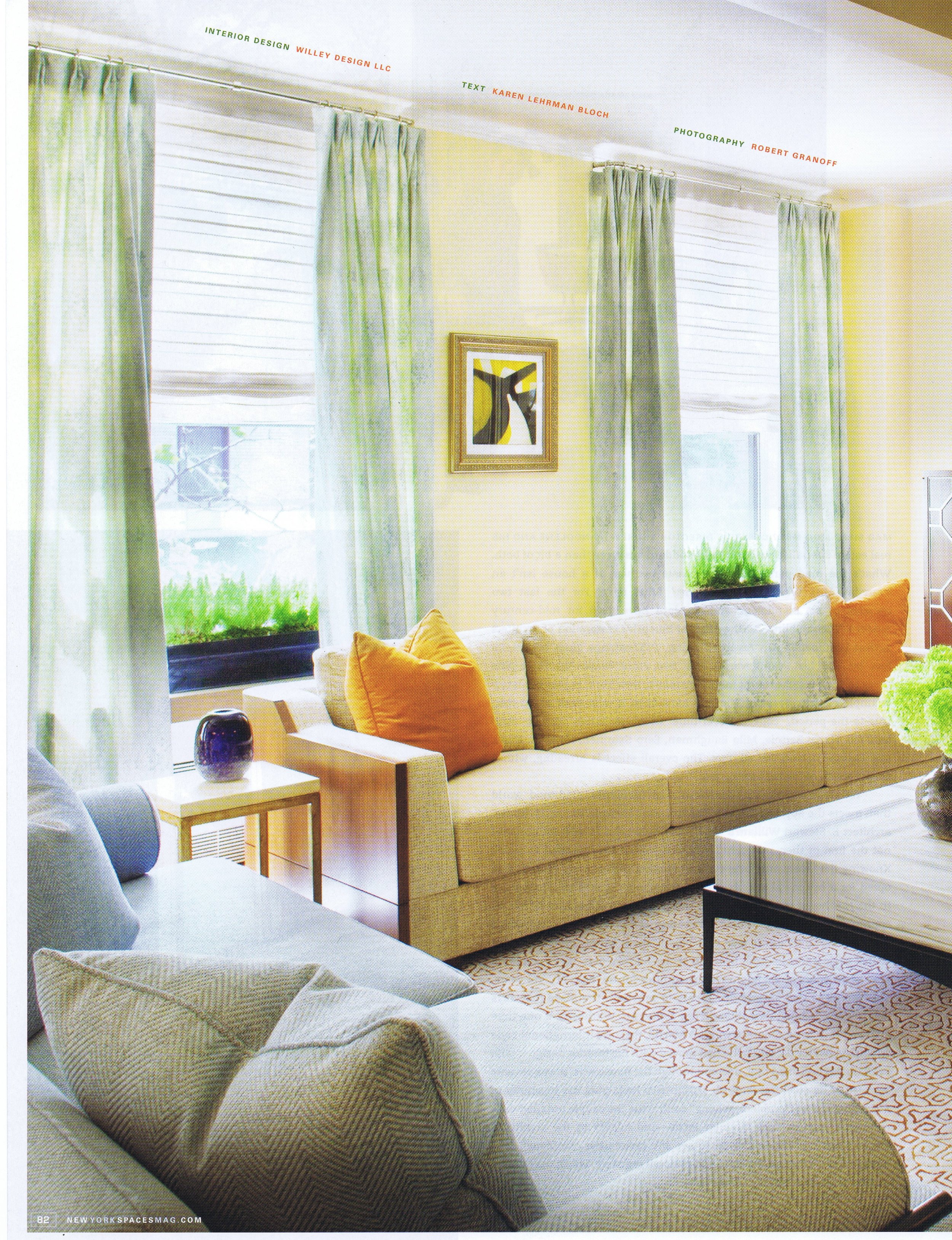
“Life’s too short for an all-beige room,” proclaims John Willey, the New York-based designer. That’s no surprise, given that since Willey opened his firm in 2006, he has made bold, often provocative decorative strokes his forte. But when a couple with three young children asked him to create a calmer, “Zen-like” ambience for their five-bedroom Carnegie Hill apartment, Willey eagerly retooled. “It’s like working a different set of muscles,” says Willey. “I was curious to see how dynamic interiors can be when color or pattern is not the main factor.”
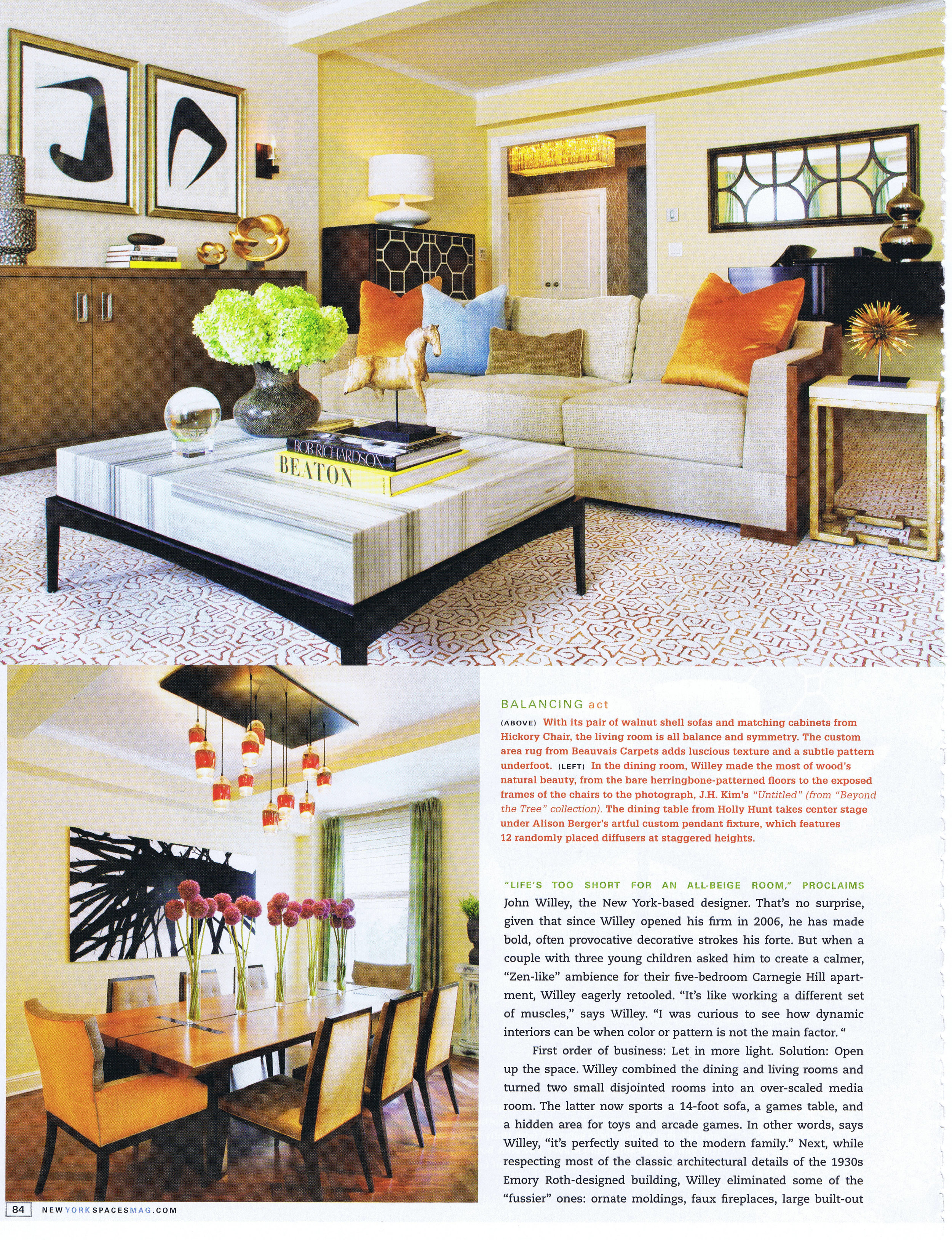
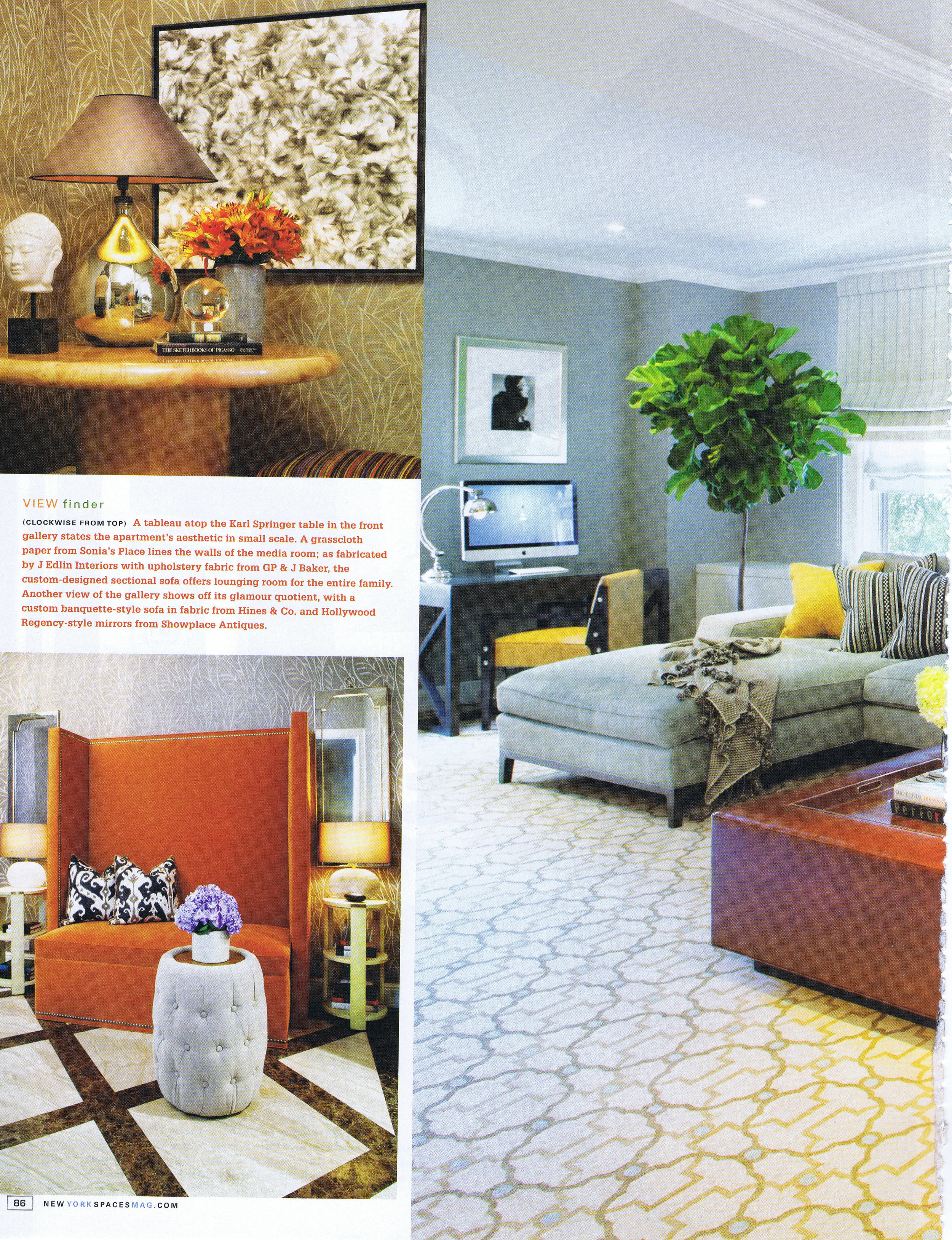
First order of business: Let in more light. Solution: Open up the space. Willey combined the dining and living rooms and turned two small disjointed rooms into an over-scaled media room. The latter now sports a 14-foot sofa, a games table, and a hidden area for toys and arcade games. In other words, says Willey, “it’s perfectly suited to the modern family.” Next, while respecting most of the classic architectural details of the 1930s Emery Roth-designed building, Willey eliminated some of the “fussier” ones: ornate moldings, faux fireplaces, large built-out and mismatched glass cabinets.
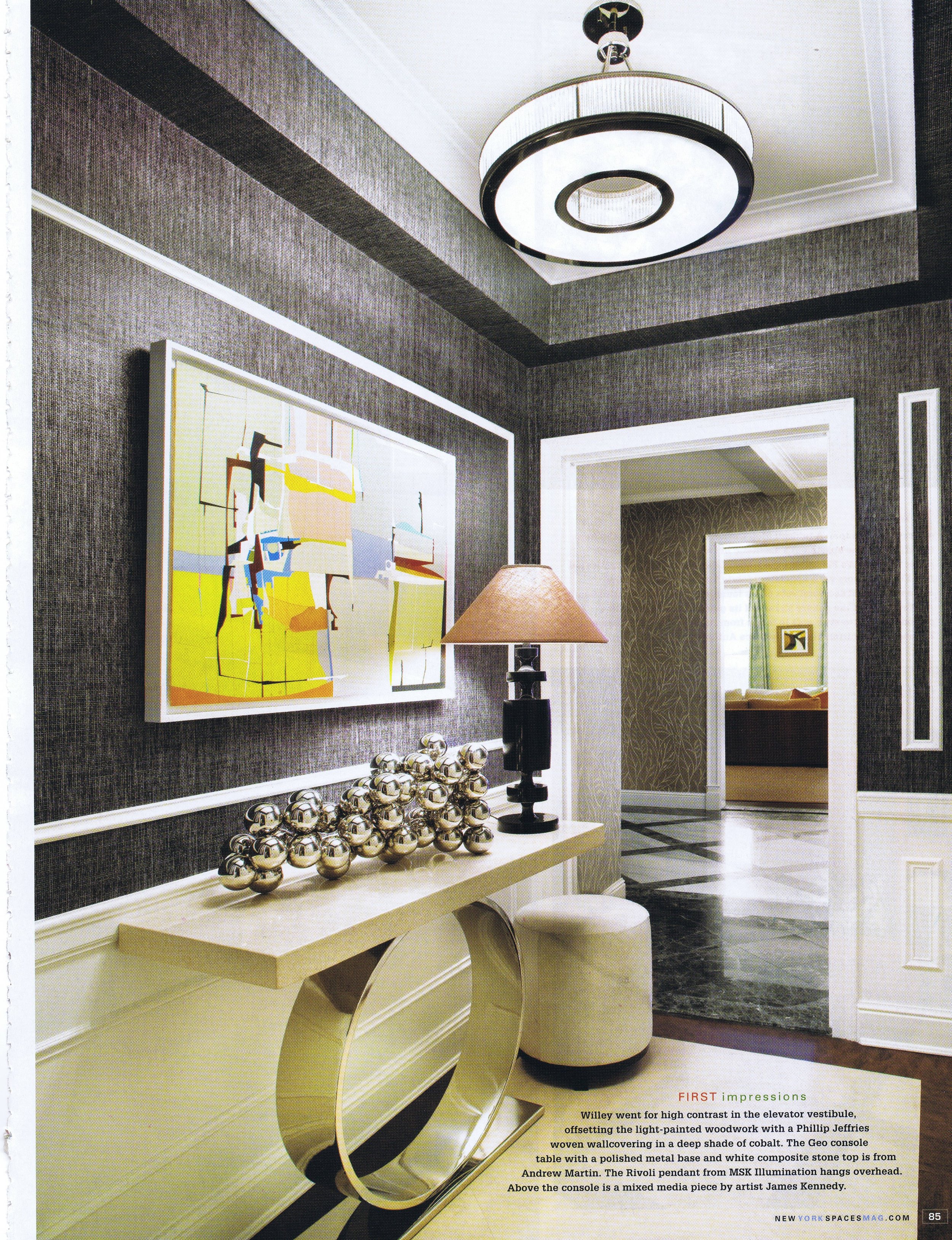
Against an airy backdrop, Willey applied a serene palette of natural stones and woods, creamy linens, pale blues, and terracotta velvets. “The wall finishes reflect and expand the available natural light,” says Willey, “while in the evenings, the rooms have an inviting glow.” Although the palette may be softer than the typical Willey home, boring it is not. Willey added dramatic, sculptural lighting and peppered the rooms with intriguing touches: an Alison Berger pendant with staggered, blown-glass globes above the dining table; a massive banquette with nailhead trim in the front gallery; a Cipollino marble coffee table with a waterfall edge in the living room.
“My goal is always to ‘read between the lines,’ to provide clients with unexpected design solutions that bring an element of surprise to their original requests,” says Willey. Because none of the accents are jarring, they work to enhance rather than undercut a sense of unity and serenity. “I never design rooms so that one item becomes the ‘star,’” says Willey. “The combination of items creates a beautiful, cohesive space, which is much more timeless.”


